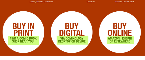
Its amazing to still come across web design failures like this one. The image above is a screen cap from the Northlanders, a site about a series of graphic novels about Vikings. The main purpose of this site is to sell the books, either physical or digital copies.
The designer, who is undoubtedly from a print background, realized this and used the large white circles and large text to draw the visitors eye to those element. But they failed massively by only making the small text below the “Buy…” headers the clickable links, as I highlighted above. Anyone who actually wants to purchase the books has to be lucky enough to mouse over just the right area to find the link.
This is a multi-level fail. We’ll ignore the fact that the underlying markup is table-soup from 1999. At least the large text should be a link, most users will hover over that first, not the smaller text below. What’s worse, the links aren’t simple link elements, it uses an image map to define the clickable regions, since all 3 circles are part of a single image. And, if you decide go and use an imagemap, why do you not make the whole circle clickable using the circle shape allowed in imagemaps?
You might think that such design decisions don’t matter, but this design makes it harder for users to buy what you are selling. Its costing you sales, and it doesn’t need to.